Candlestick charts, originating from Japan, are a widely used tool in financial markets, including stocks, forex, commodities, and more. These charts provide a visual representation of price movements over a specific period, helping traders make informed decisions.
In this guide, we’ll explore the structure of candlestick charts, how to interpret them, and common patterns that can help predict price movements.

Understanding the Structure of a Candlestick
A candlestick chart consists of multiple ‘candles‘, each representing price movement during a specific period (e.g., one minute, one day, one week).
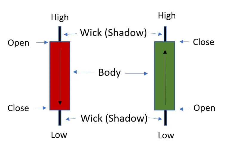
Each candle comprises two main parts: the body and the shadows (also called wicks).
- Body:
- The body reflects the price movement between the opening price (Open) and the closing price (Close) during the selected time frame.
- If the closing price is higher than the opening price, the body is often unfilled or colored green, representing a bullish (upward) movement.
- Conversely, if the closing price is lower than the opening price, the body is filled or colored red, indicating a bearish (downward) movement.
- Shadows (Wicks):
- The thin lines above and below the body represent the highest and lowest prices traded during that period.
- The upper shadow shows the difference between the high price and the body’s top, while the lower shadow shows the difference between the low price and the body’s bottom.
Interpreting Candlesticks
Candlestick charts offer more than just price movement; they provide insight into market sentiment and psychology.
For instance.
- A long bullish candle signals strong buying pressure, while a long bearish candle indicates strong selling pressure.
- A long shadow on either side of the body suggests high volatility, as buyers and sellers have engaged in a struggle for control.
Common Candlestick Patterns
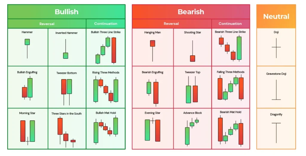
Traders use candlestick patterns to predict potential price movements.
Below are some of the most well-known patterns.

- Doji:
- A doji occurs when the opening and closing prices are nearly the same, resulting in a very small or non-existent body.
- It signifies market indecision, as buyers and sellers are in balance, often signaling a potential reversal in trend.
- Hammer:
- A hammer has a small body with a long lower shadow, indicating that although sellers pushed prices lower, buyers regained control by pushing the price back up.
- It’s usually found at the bottom of a downtrend, suggesting a possible upward reversal.
- Shooting Star:
- The opposite of a hammer, a shooting star has a small body with a long upper shadow, signaling that buyers tried to push the price higher, but sellers took over, driving it back down.
- This pattern typically appears at the top of an uptrend, indicating a potential reversal to the downside.
- Bearish Engulfing:
- This pattern forms when a small bullish candle is followed by a larger bearish candle that ‘engulfs’ the previous one.
- It signifies that sellers have overwhelmed buyers, indicating a possible trend reversal to the downside.
- Bullish Engulfing:
- The opposite of the bearish engulfing pattern, it forms when a small bearish candle is followed by a larger bullish candle.
- It suggests that buyers are gaining strength, potentially reversing a downward trend.
Using Candlestick Patterns for Market Analysis
Candlestick charts are not just about observing past price movements; they are essential tools for forecasting future trends. However, it is important to avoid making decisions based solely on candlestick patterns. To improve accuracy, traders often combine candlestick analysis with other technical indicators such as moving averages, RSI (Relative Strength Index), or volume trends. For instance, a doji appearing near a resistance level might signal an impending market reversal, but traders should confirm this with other indicators before making decisions.
Application Across Financial Markets
As mentioned earlier, candlestick charts are applicable in various financial markets, including forex, commodities, and cryptocurrency trading, in addition to stock markets. Their versatility makes them a valuable tool for traders across asset classes, allowing a deeper understanding of market dynamics and helping traders refine their strategies. By mastering candlestick charts, you can gain insights into market sentiment, identify key levels of support and resistance, and improve the timing of your trades.
Conclusion
Candlestick charts are powerful visual tools that help traders not only observe past price movements but also anticipate future trends. Whether you are a beginner or an experienced trader, understanding candlestick structures and patterns is crucial for making informed decisions in the markets. By combining these insights with other technical analysis tools, you can refine your trading strategy and increase your chances of success across various markets, from stocks to cryptocurrencies.
If you are new to trading, taking the time to learn and apply candlestick chart analysis will be a critical step in building a strong foundation for long-term investment success. Thank you for reading, and may your trading journey be successful!
Also Read:
https://www.investopedia.com/terms/e/eps.asp
https://www.stockguidebook.com/bid-price-vs-ask-price-essential-concepts/


